WORLD MUSIC WEDNESDAY.
Promotional Material Design | 2021 Spring
Using one font and one shade of color, design promotional materials celebrating the World Music Wednesday event at the Old Town School of Folk Music Club.
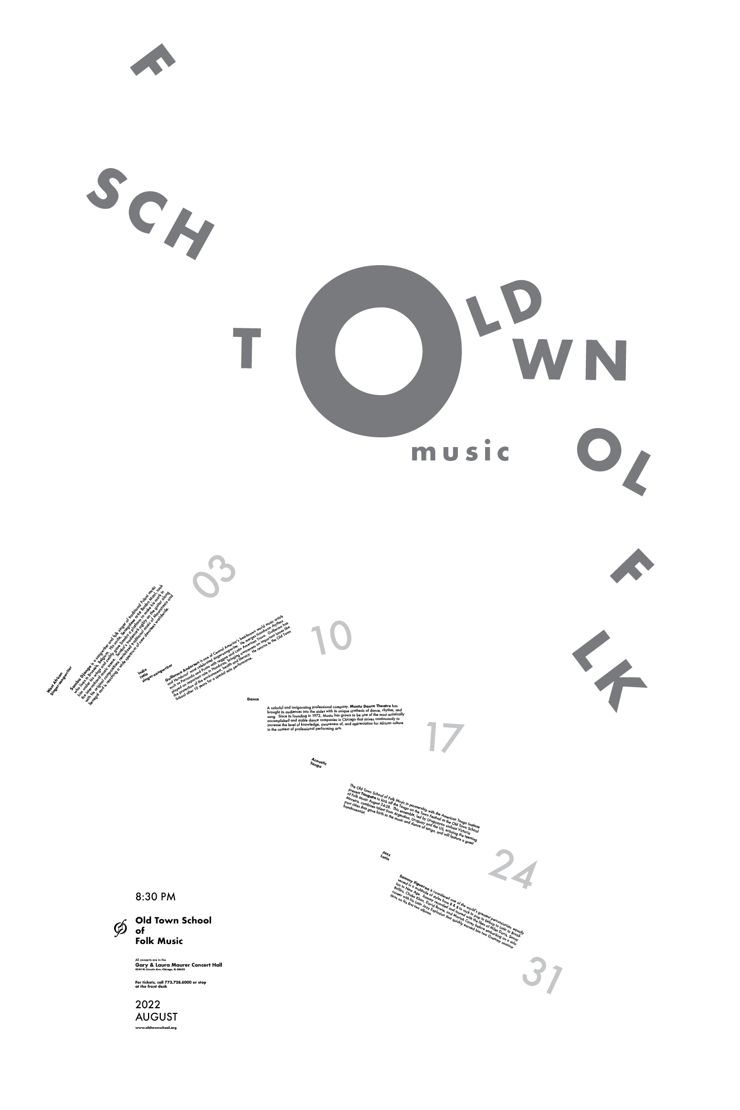
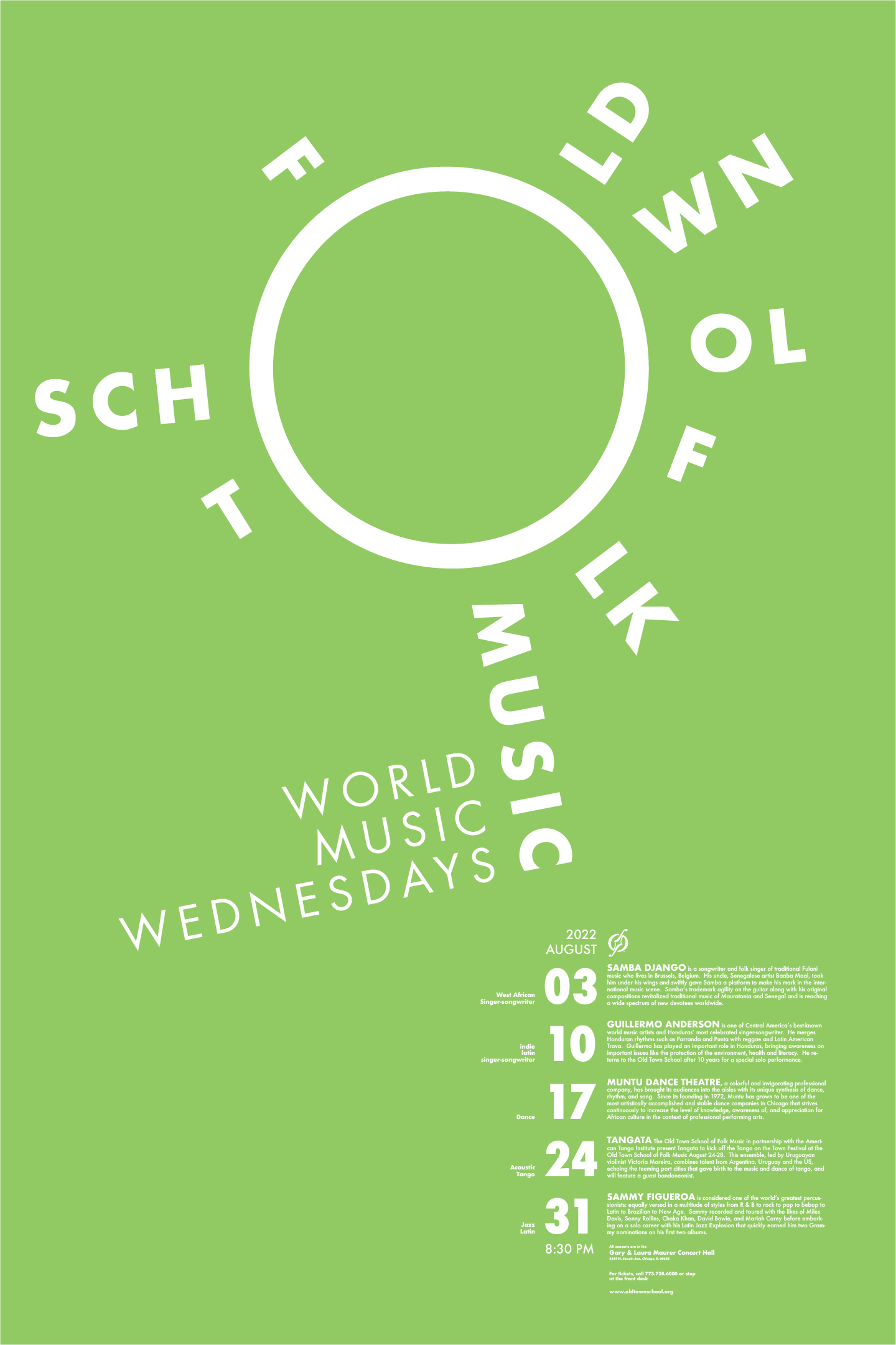
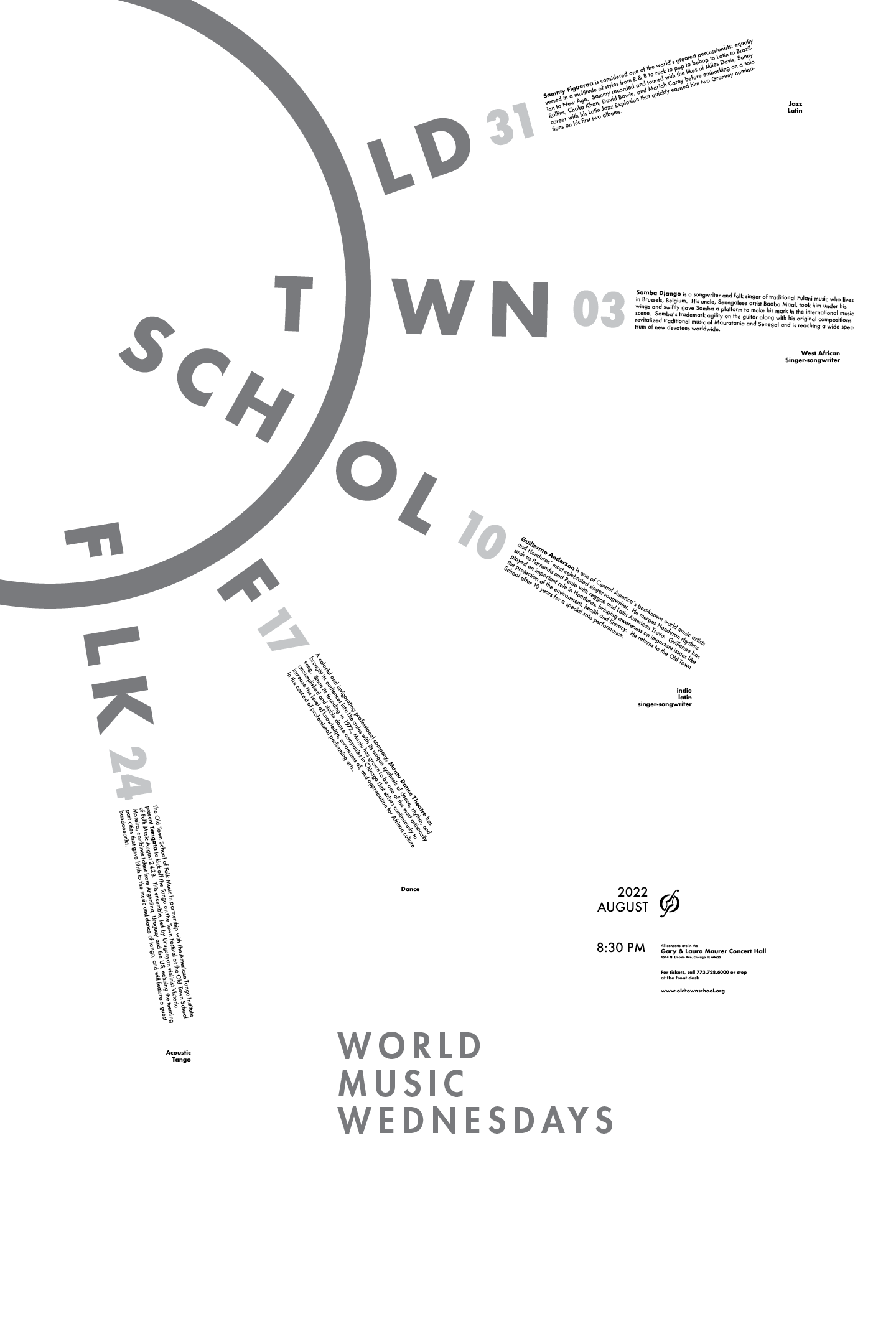
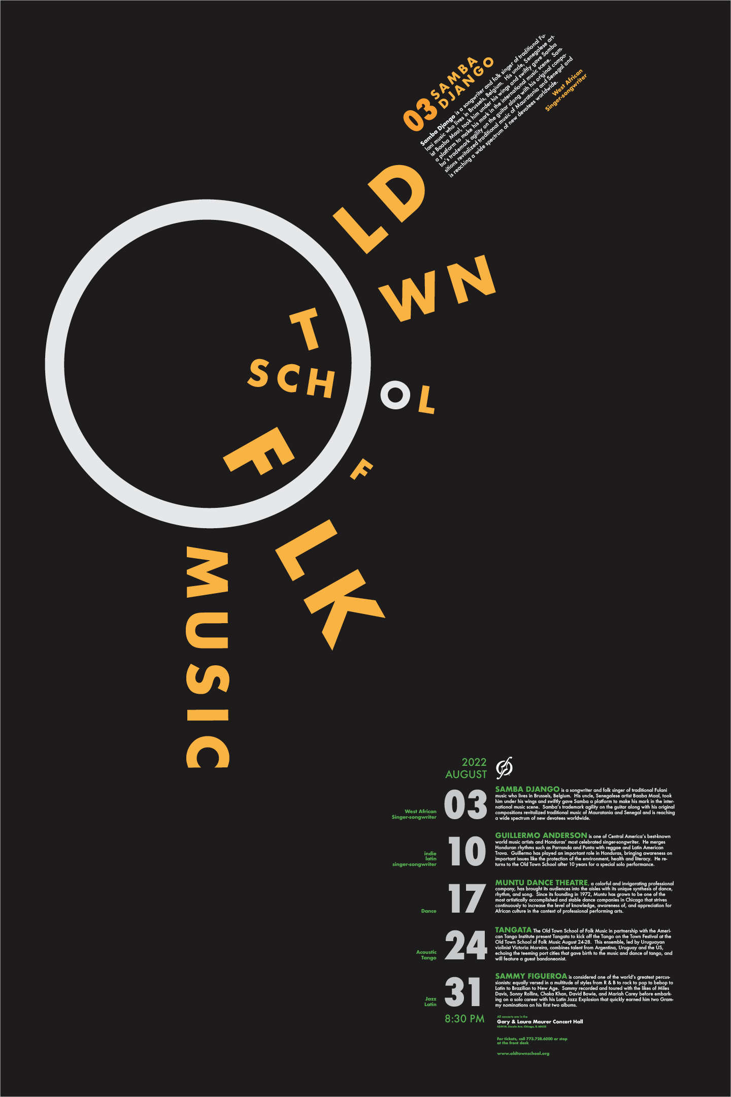
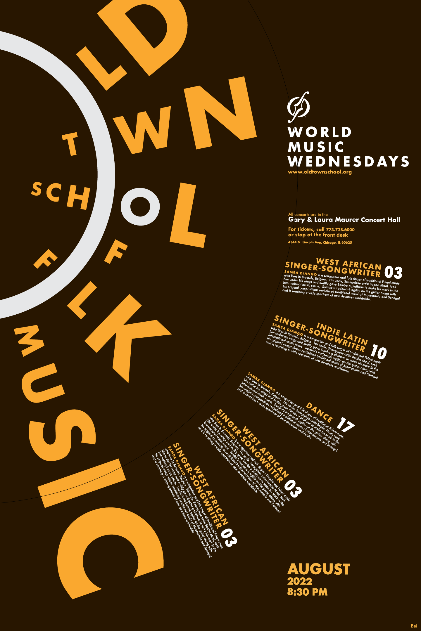
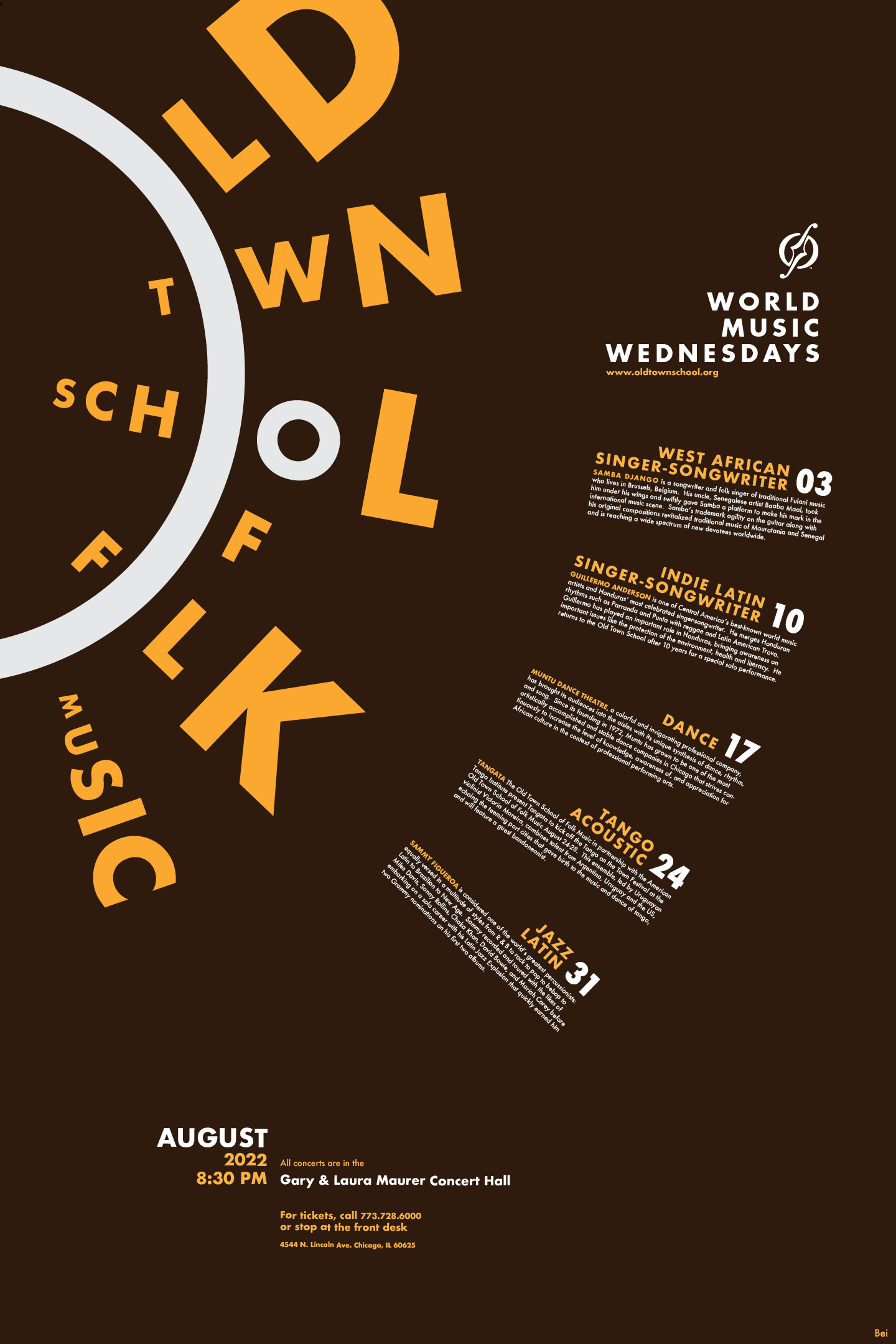
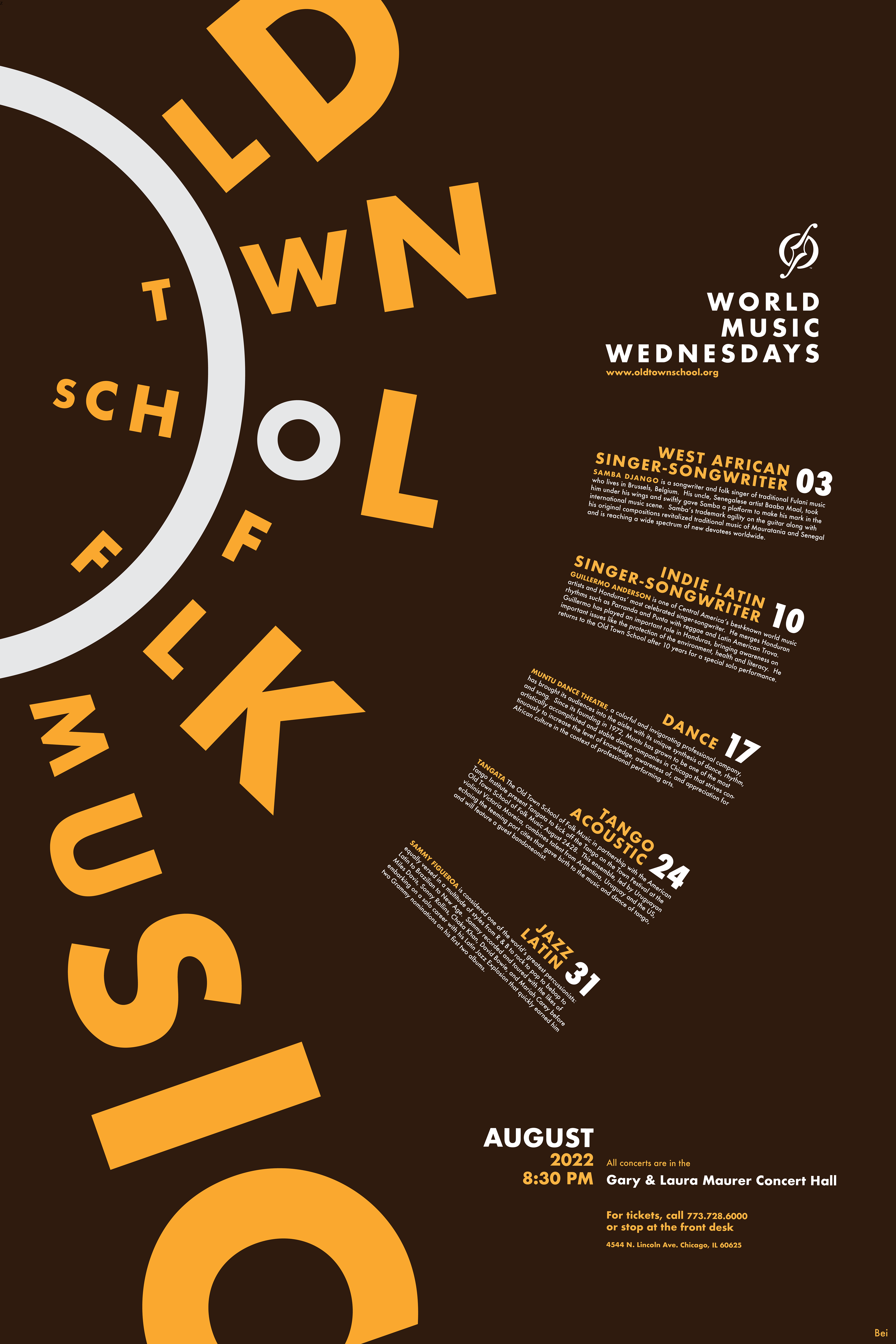
Making an exciting design with the constraints of one font and color proved challenging. After noticing that the phrase "Old Town School of Folk Music" contains many words with the letter O in it, I decided to use that "O" letterform as the center and create a radial design.
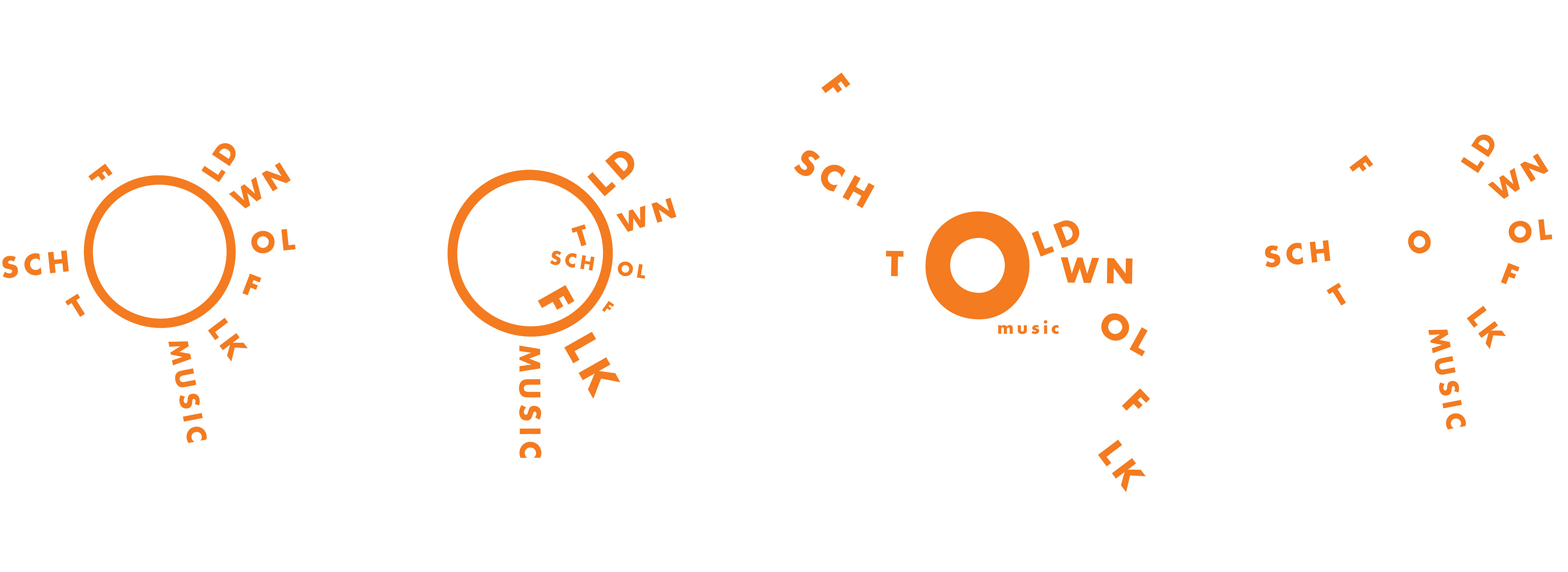
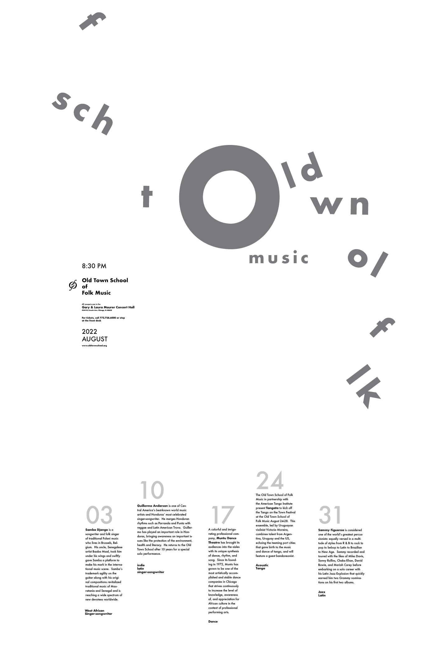
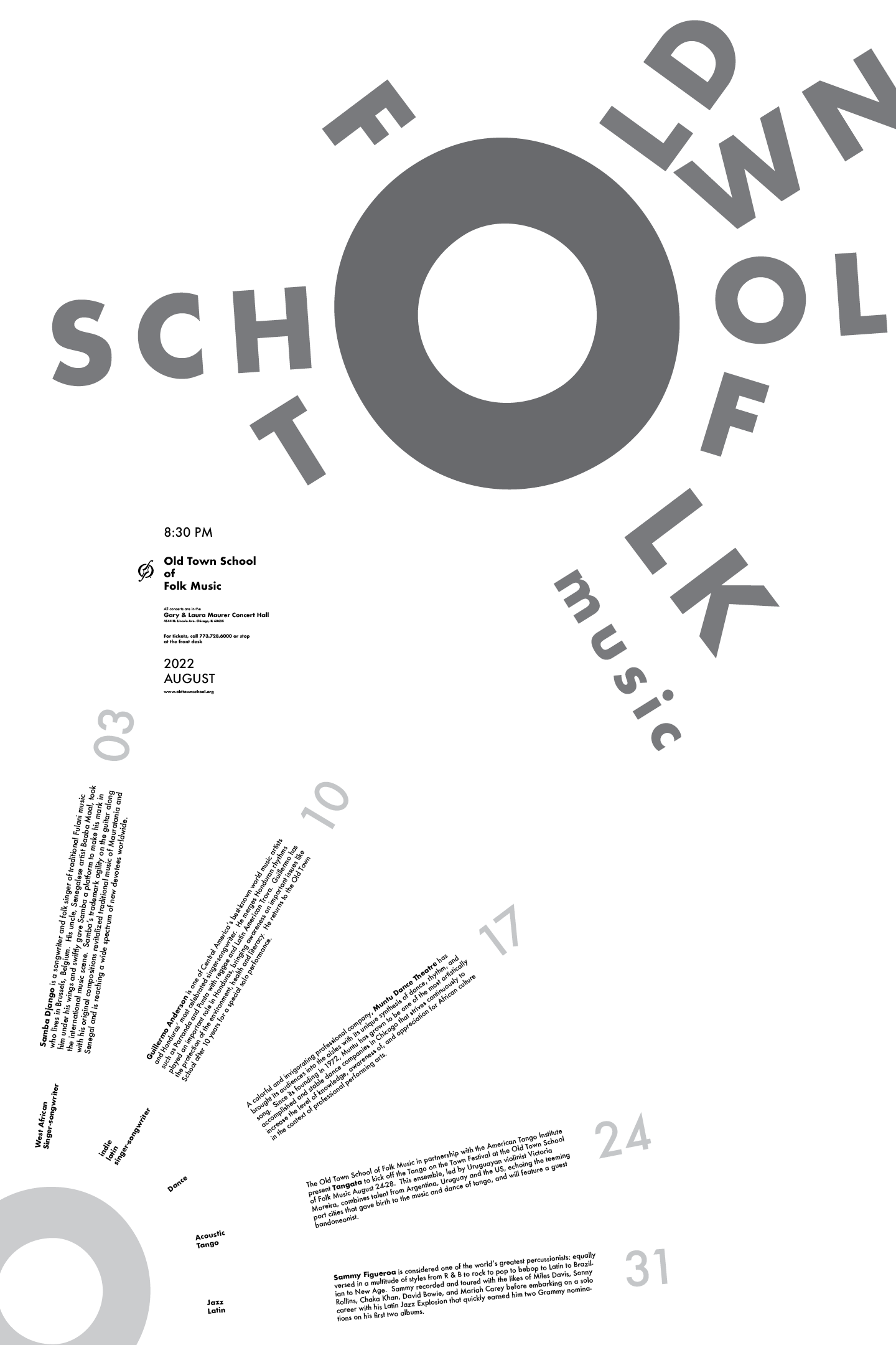
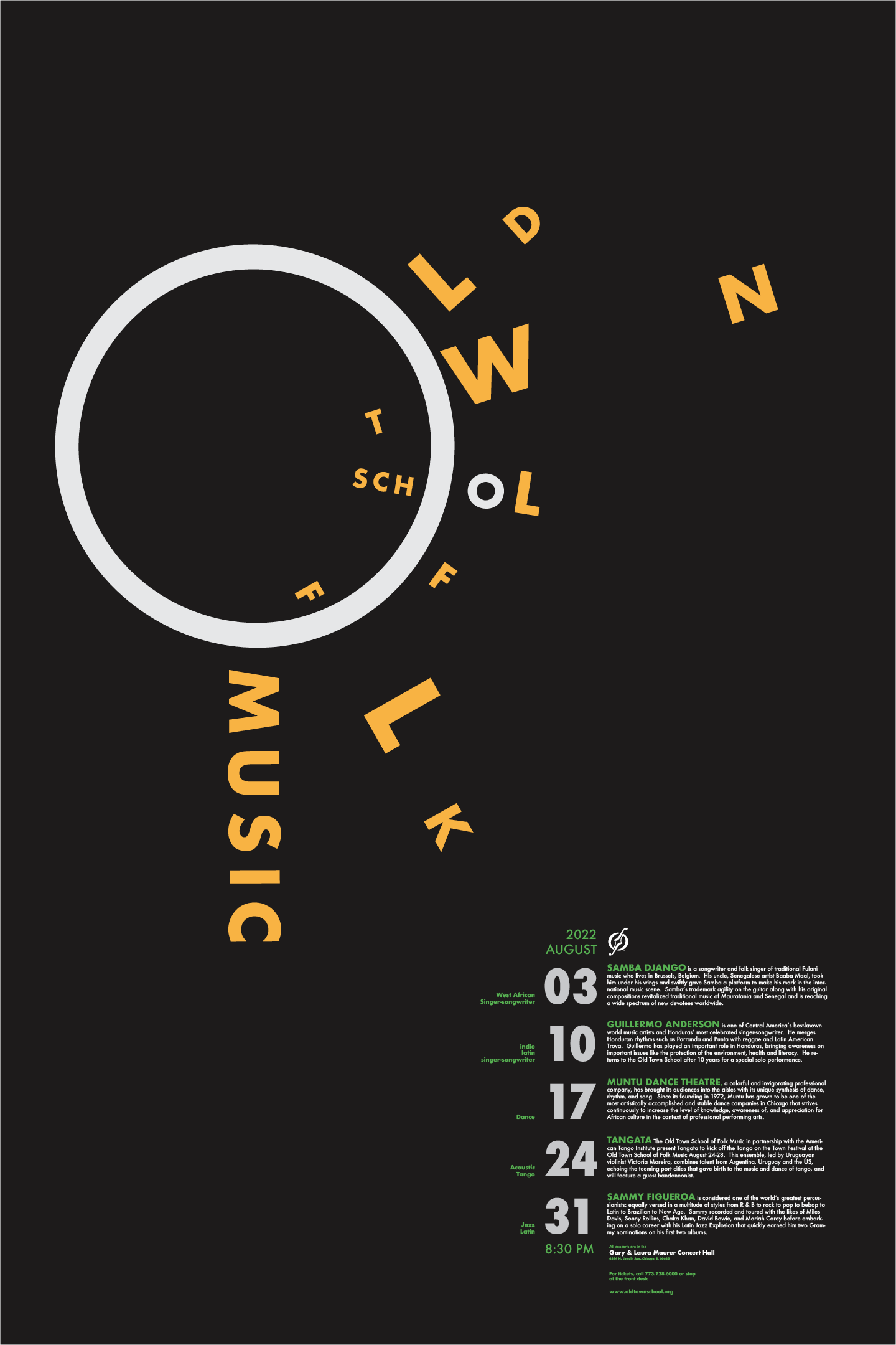
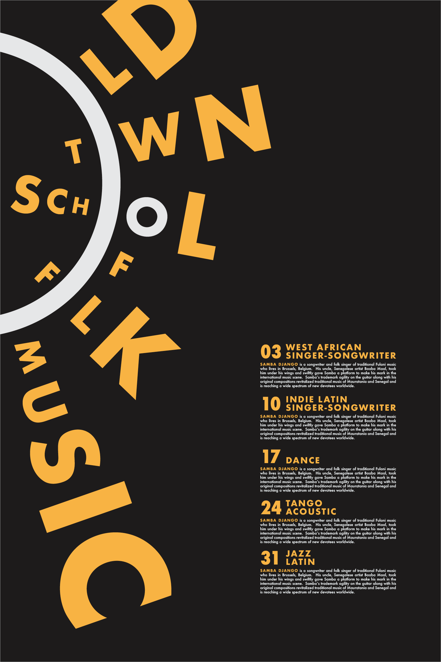
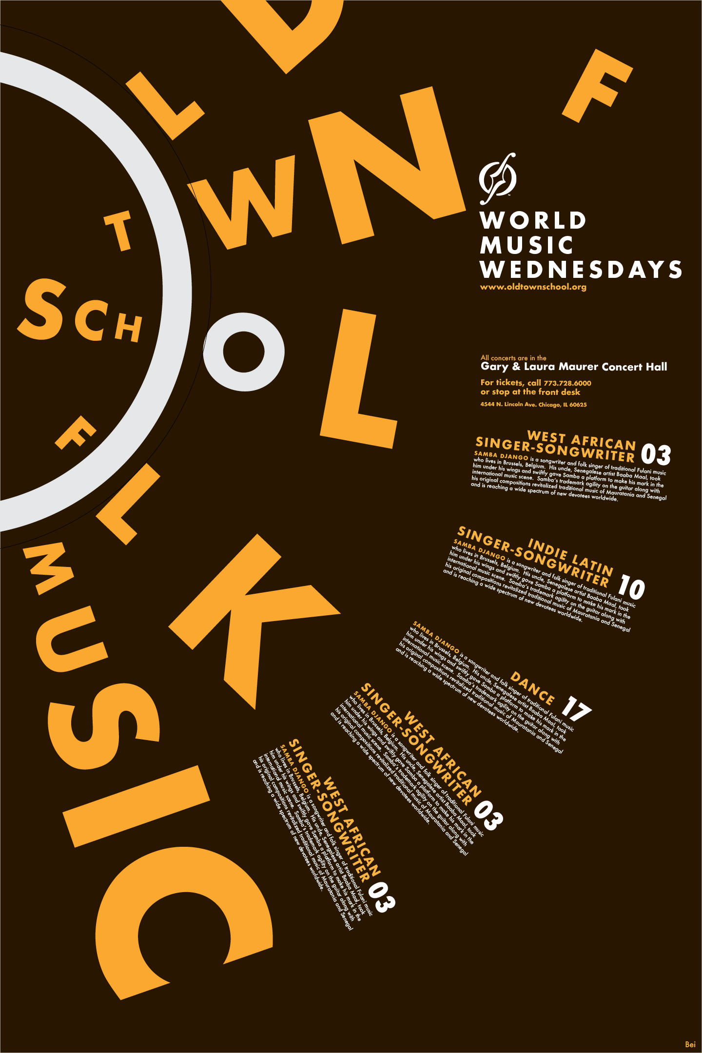
Attempts to make a legible text formation around the letter "O" with one font
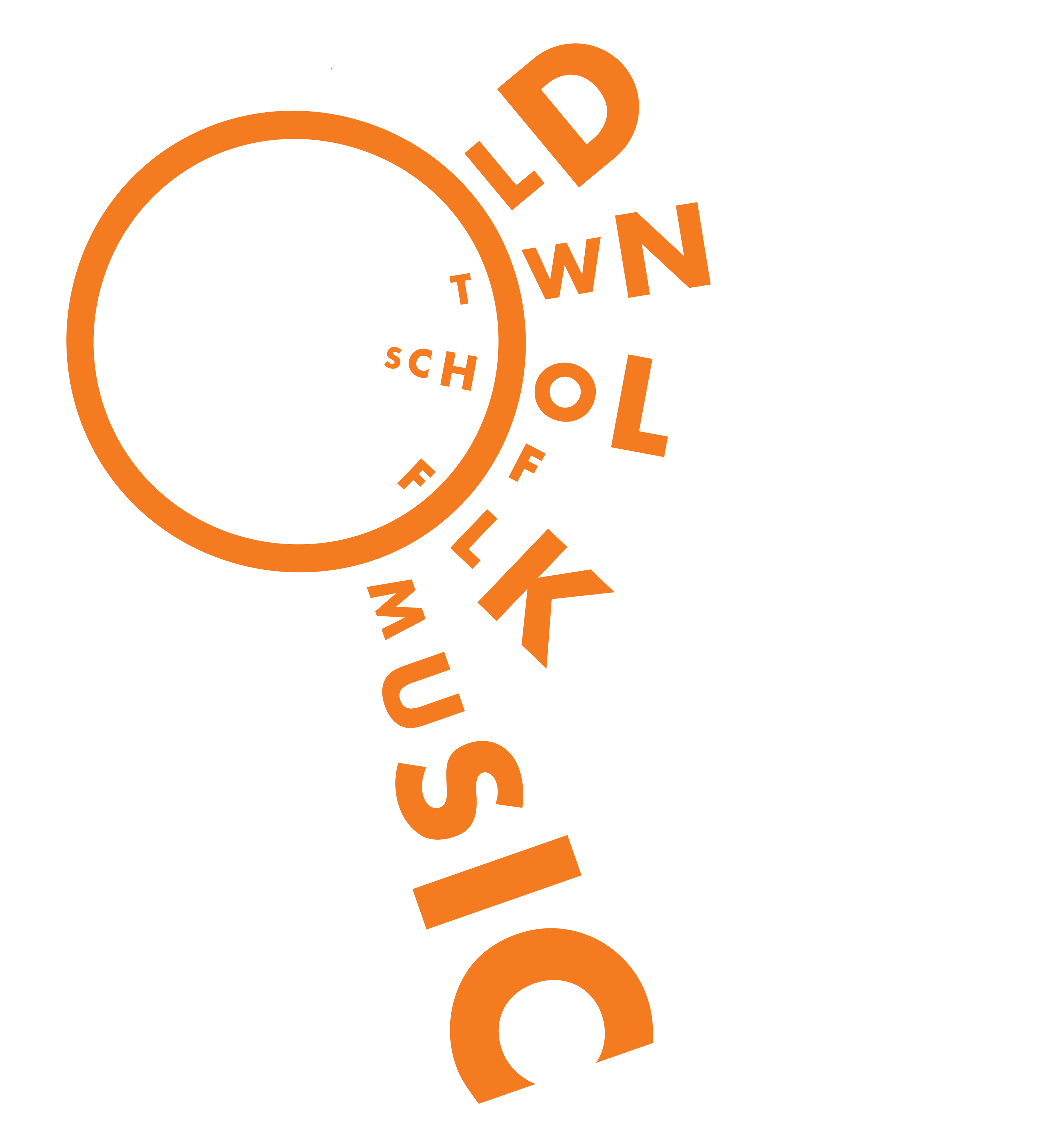
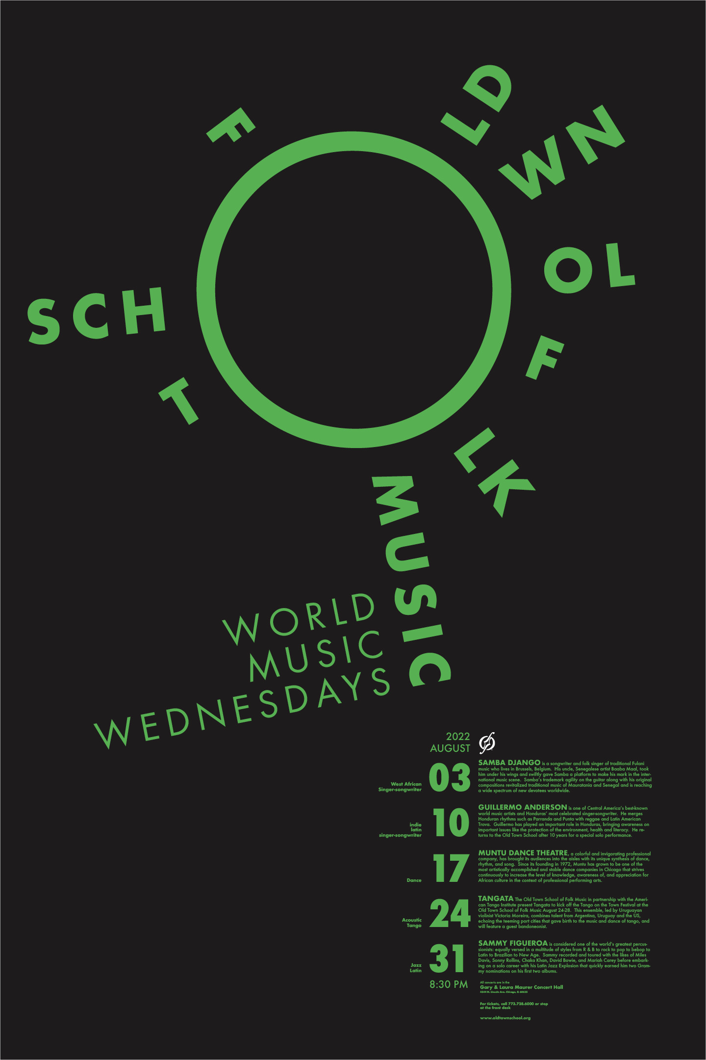
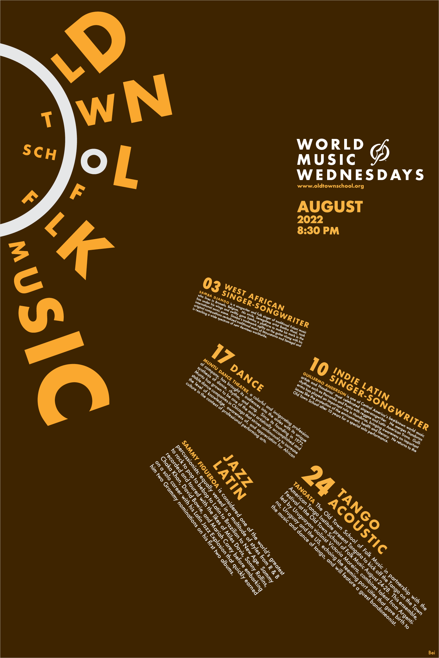
A sun made of type.
Using the letter O as the center, in turn, creates the problem of arranging type around a circle, and makes this a juggle between readability and aesthetics. After several rounds of testing, I landed on the design used on the poster. The final design contains words that are not immediately apparent, for example, "Old" and "Town." Yet by reading the other words that are easier to understand, such as "School," the viewer can start to understand the "rules of the game" and decipher them.
Using the letter O as the center, in turn, creates the problem of arranging type around a circle, and makes this a juggle between readability and aesthetics. After several rounds of testing, I landed on the design used on the poster. The final design contains words that are not immediately apparent, for example, "Old" and "Town." Yet by reading the other words that are easier to understand, such as "School," the viewer can start to understand the "rules of the game" and decipher them.
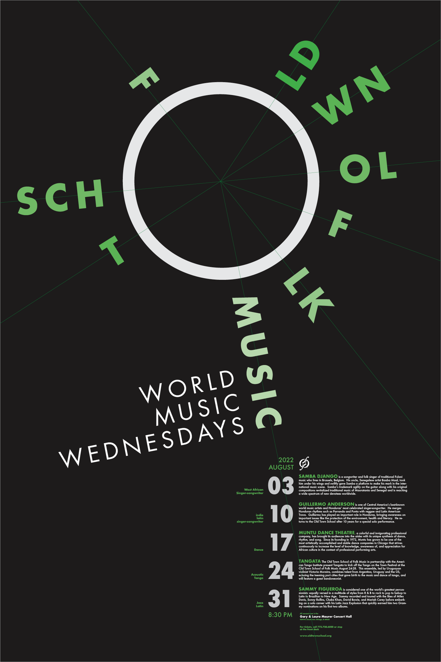
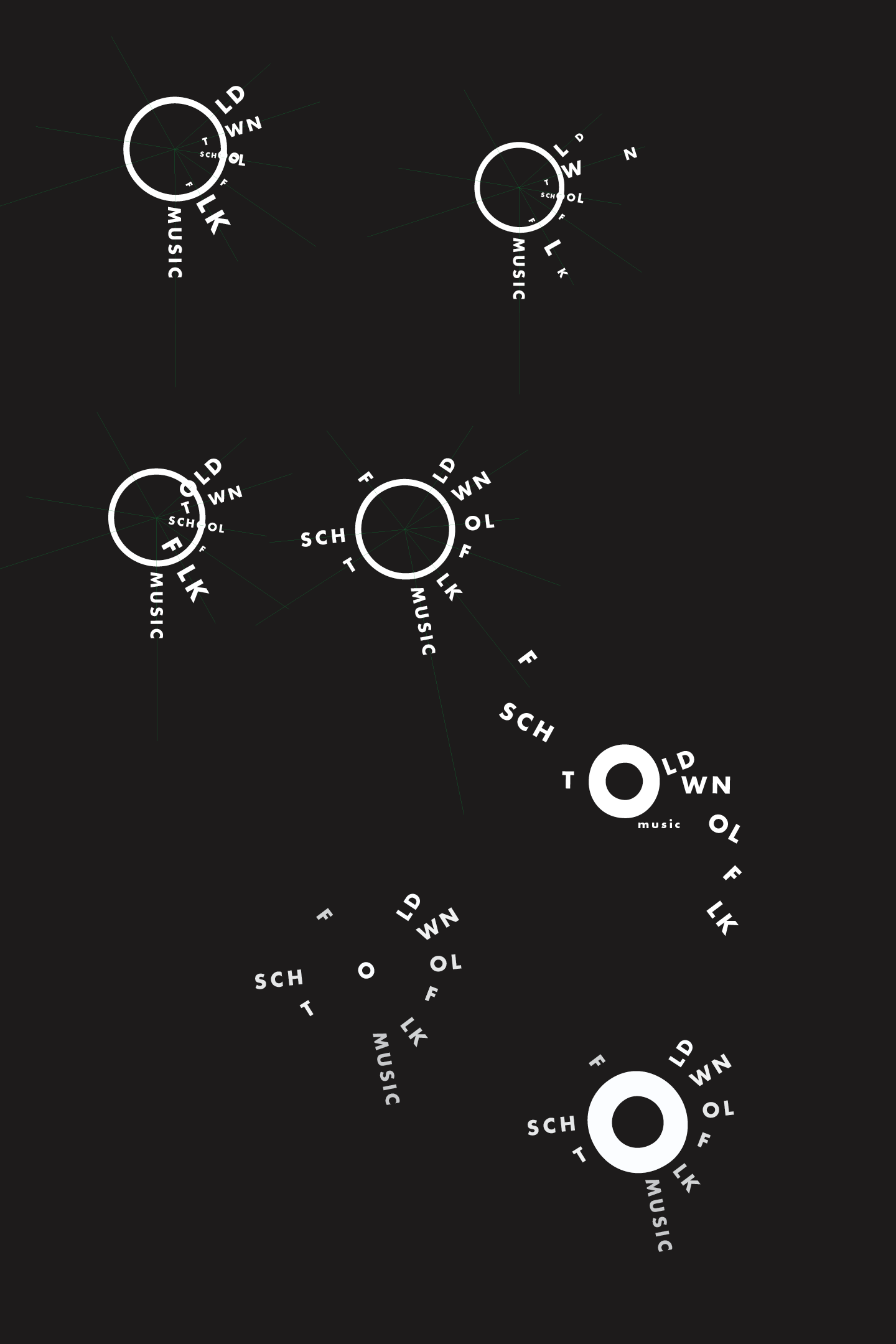
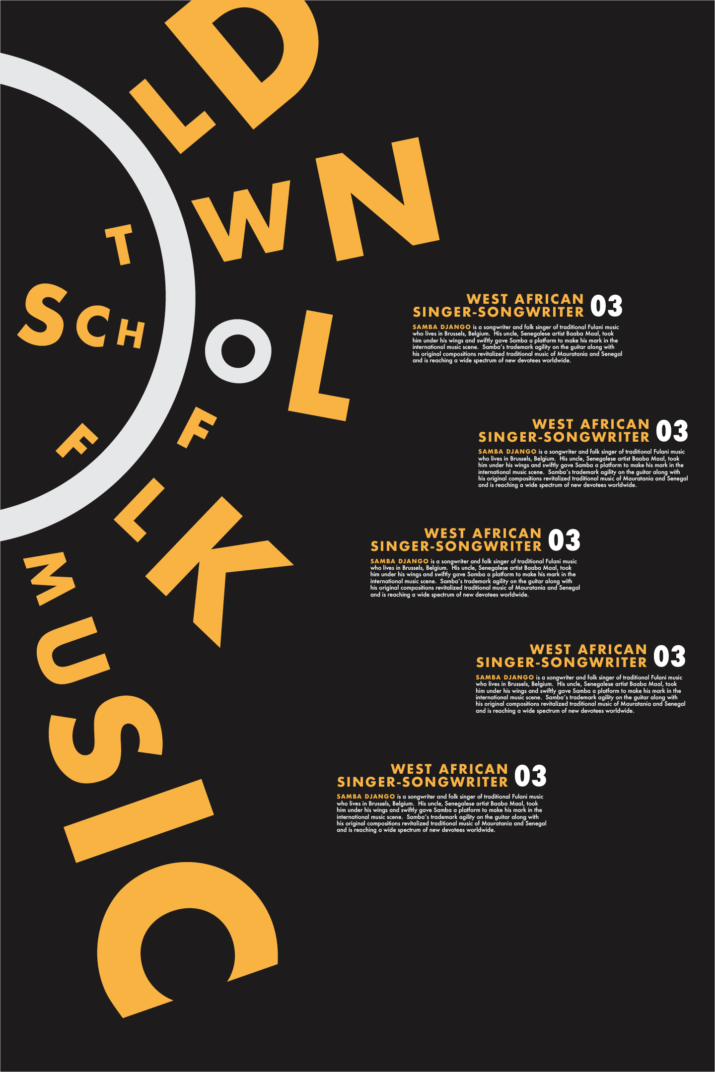
Trying out different text layout options
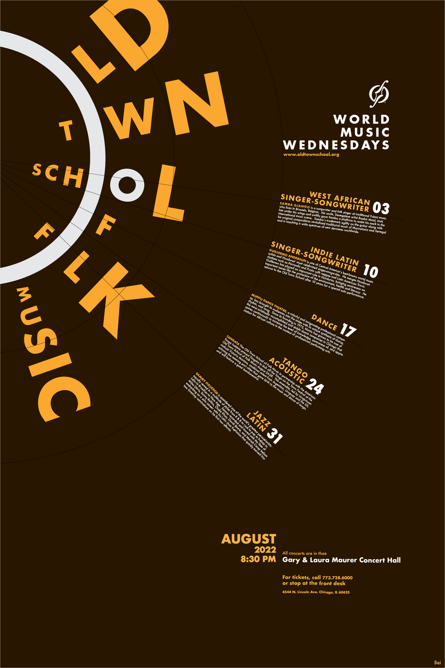
Arranging text along the circular sun motif.
I get the feeling of warmth and fun when thinking of folk music. I used a radial design for all the text on the poster to create that feeling of sitting in a warm room on a cold winter day, listening to folk. This makes it seem like the texts are sun rays radiating from the center of the letter "O," amplifying the heat.
The color I chose is also meant to bring out the thermal quality. The dark brown background is used to integrate the rustic nature of folk music.

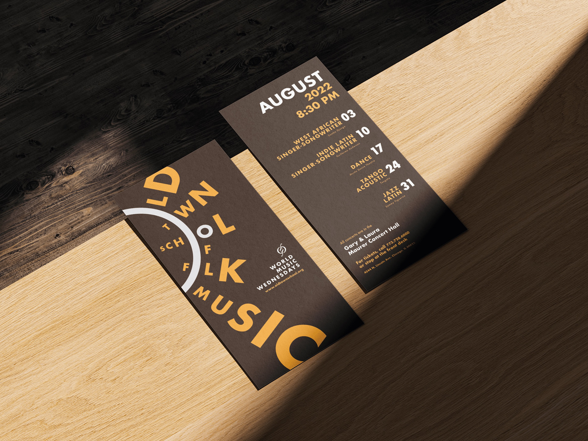
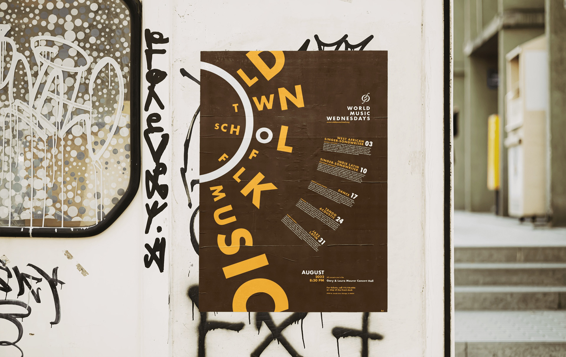
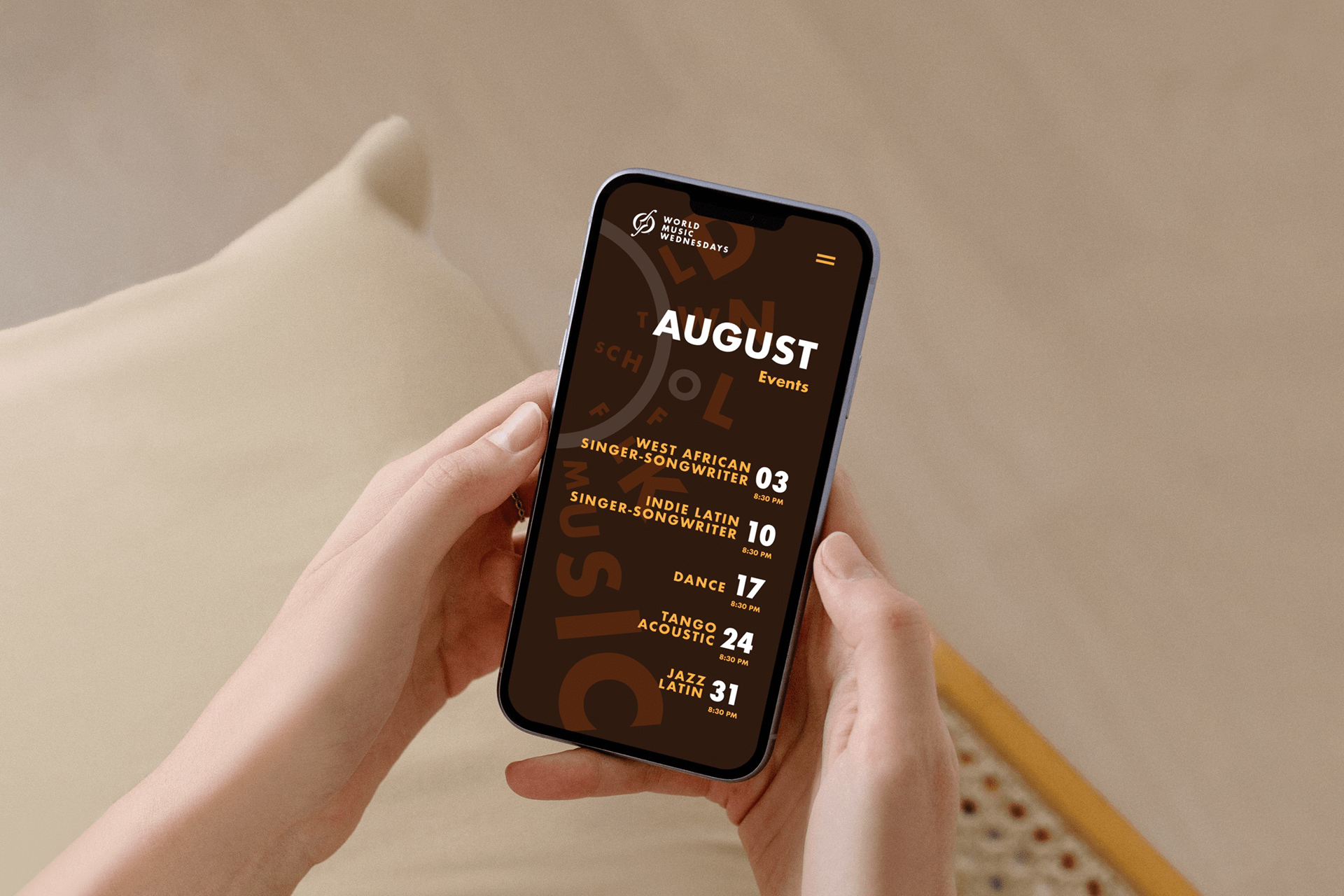
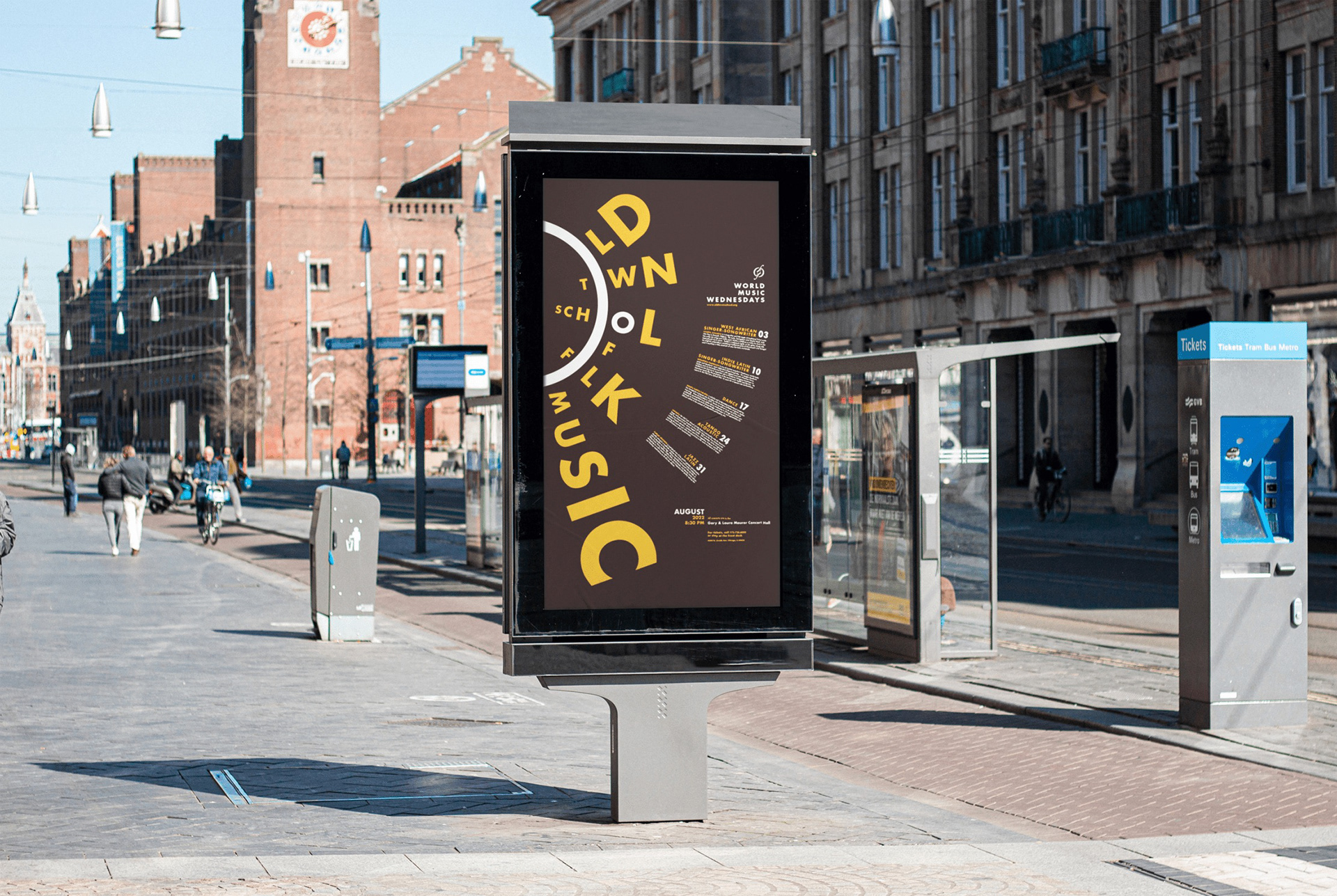
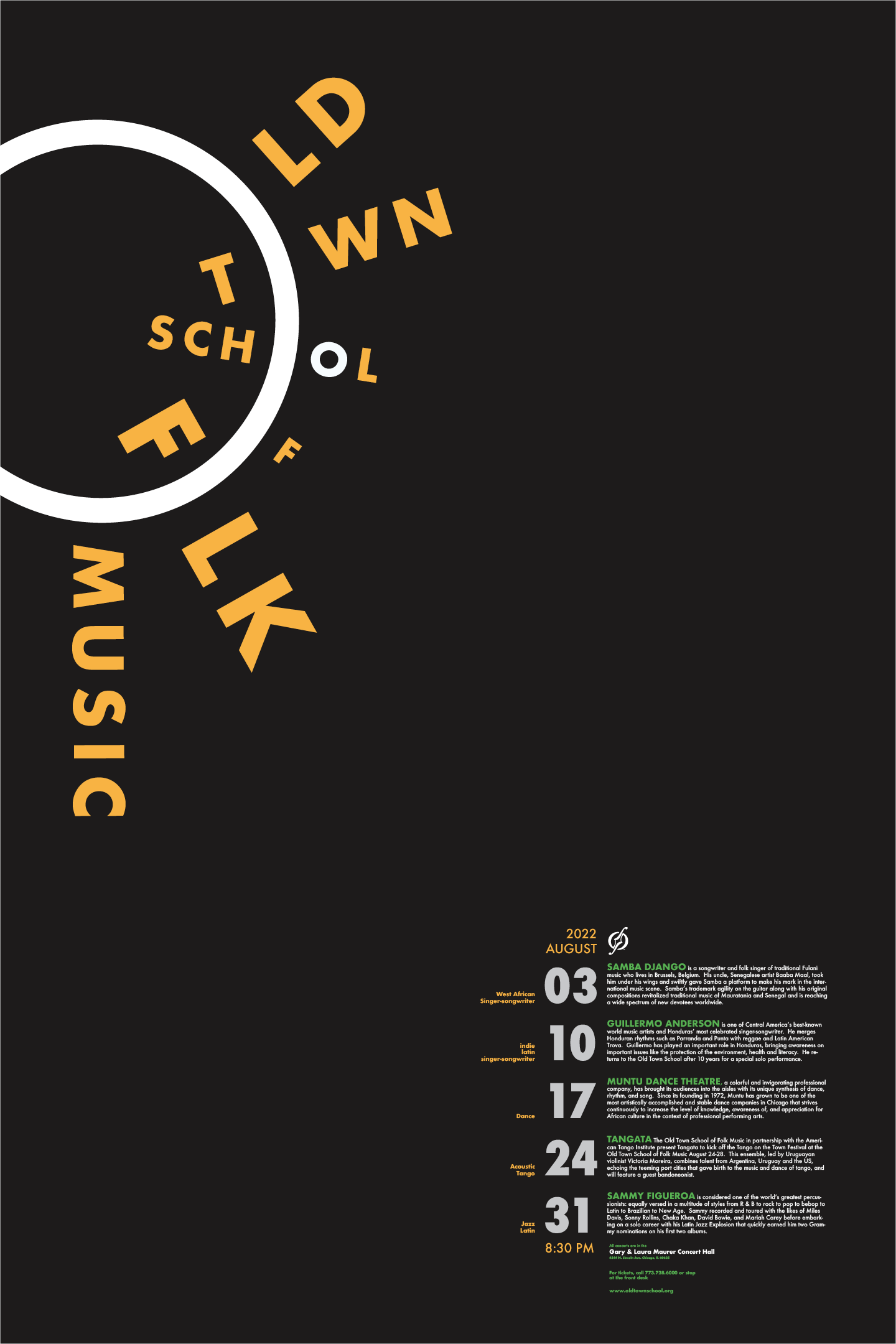
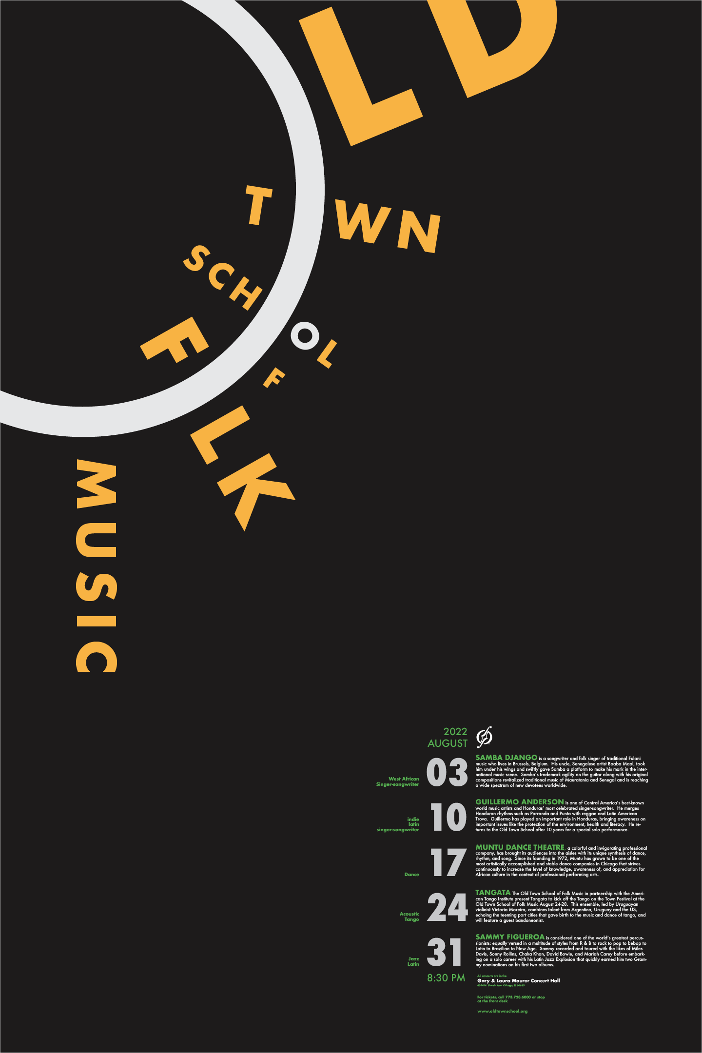
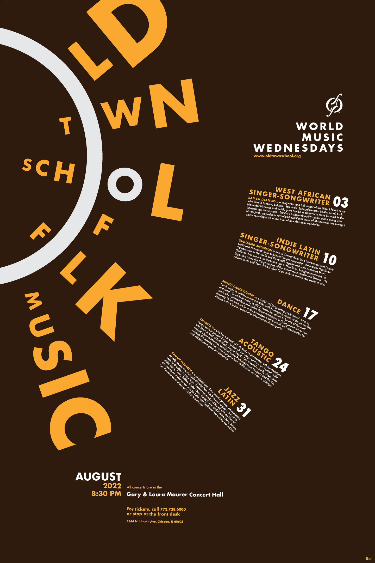
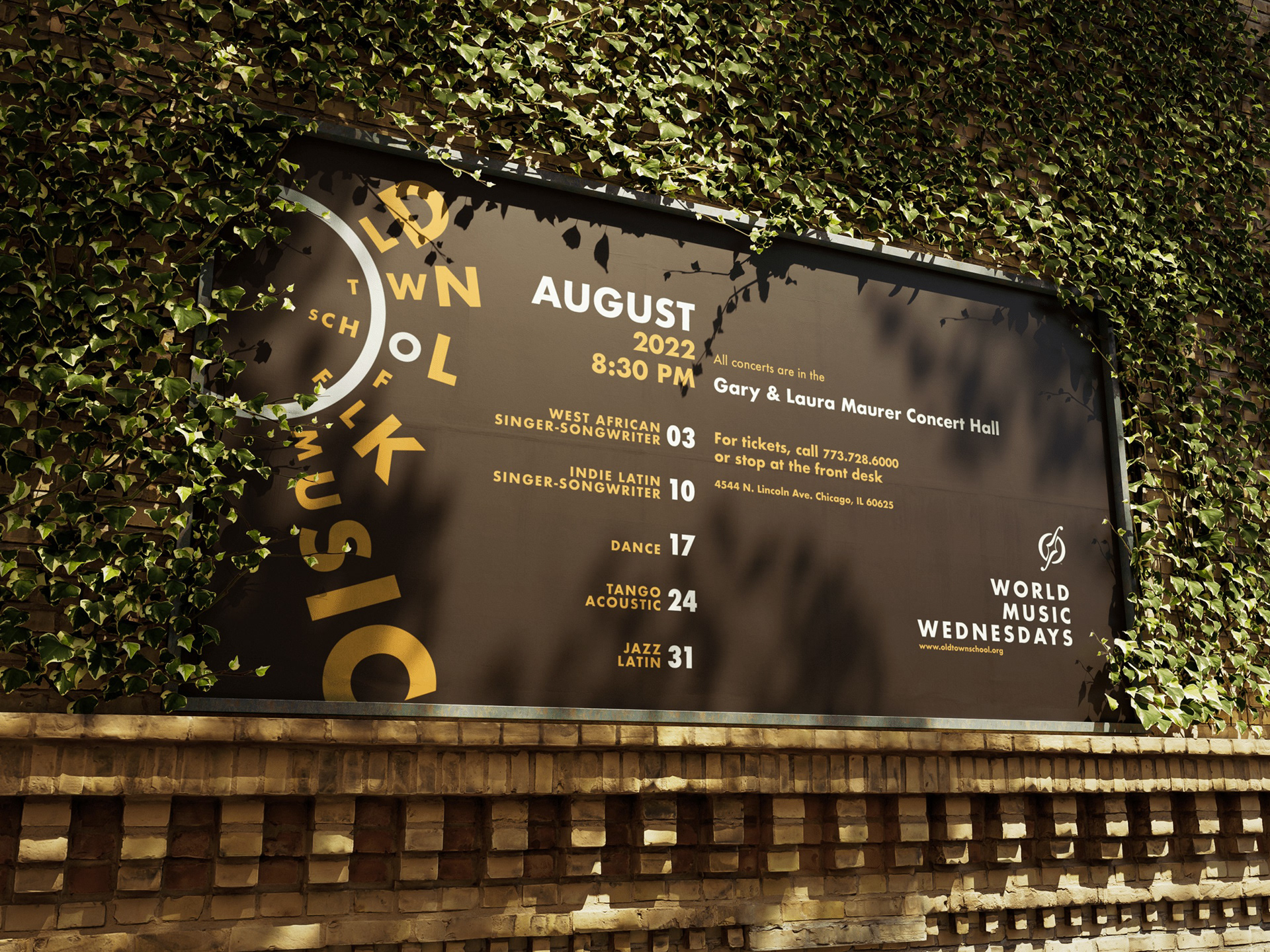
Final Poster
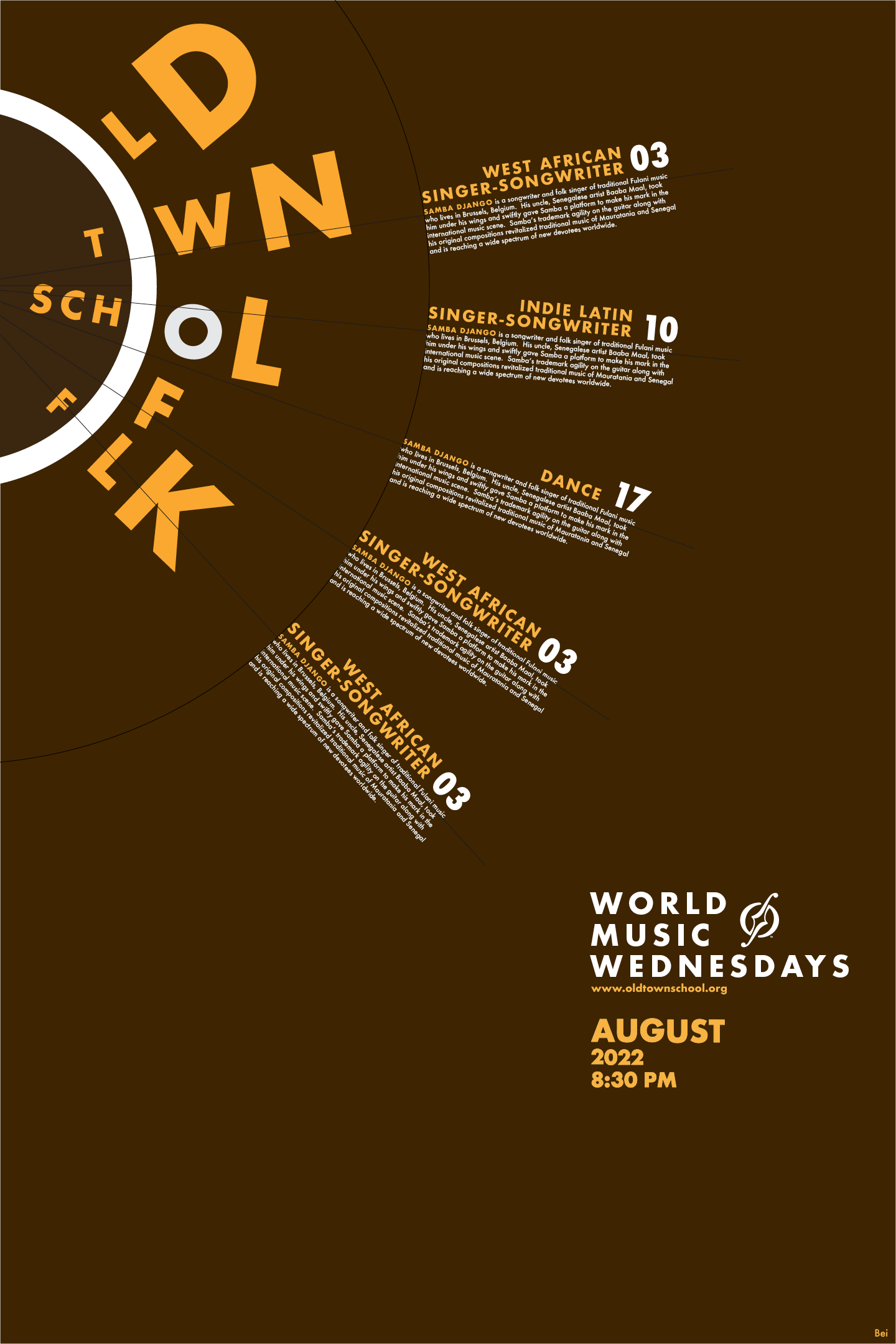
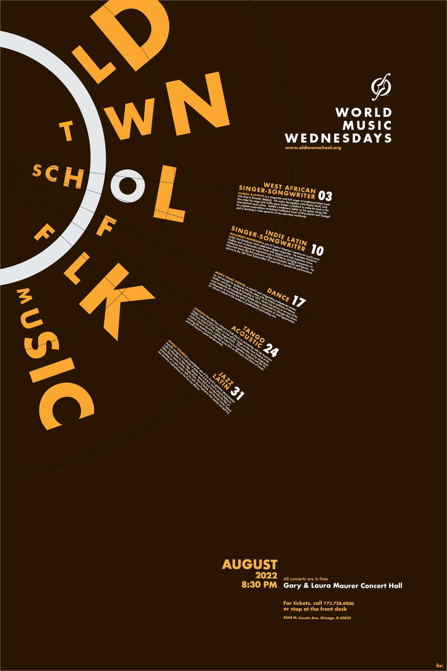
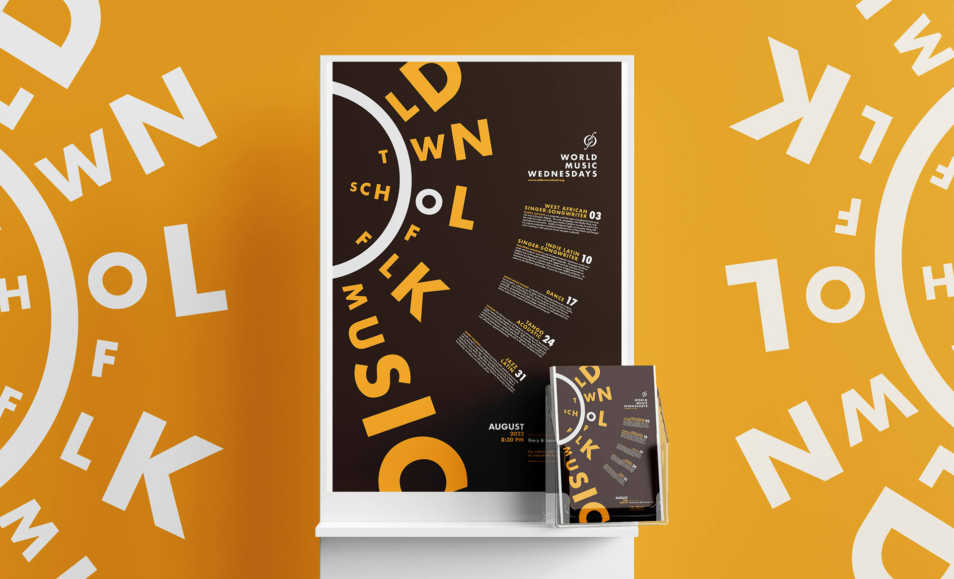
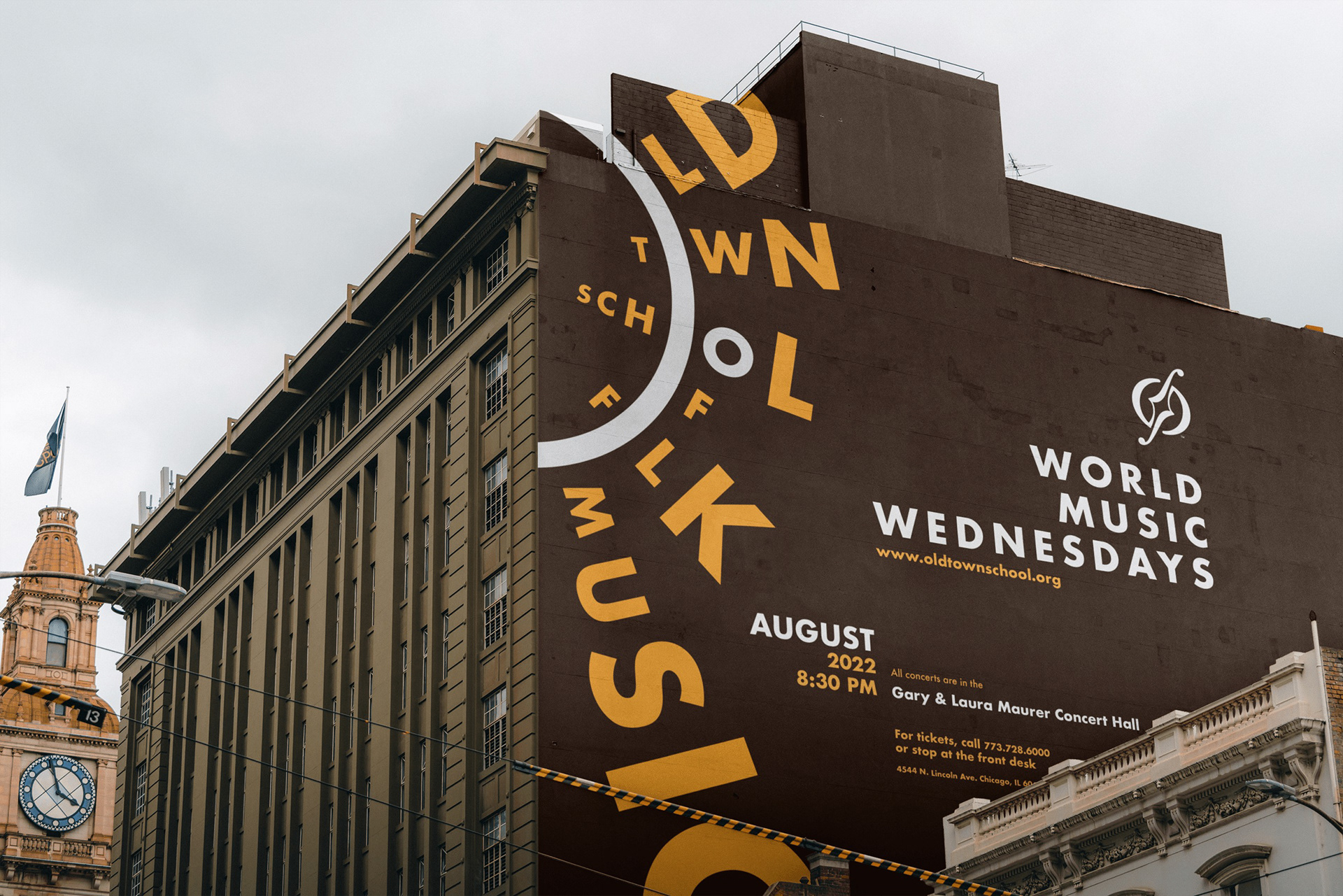
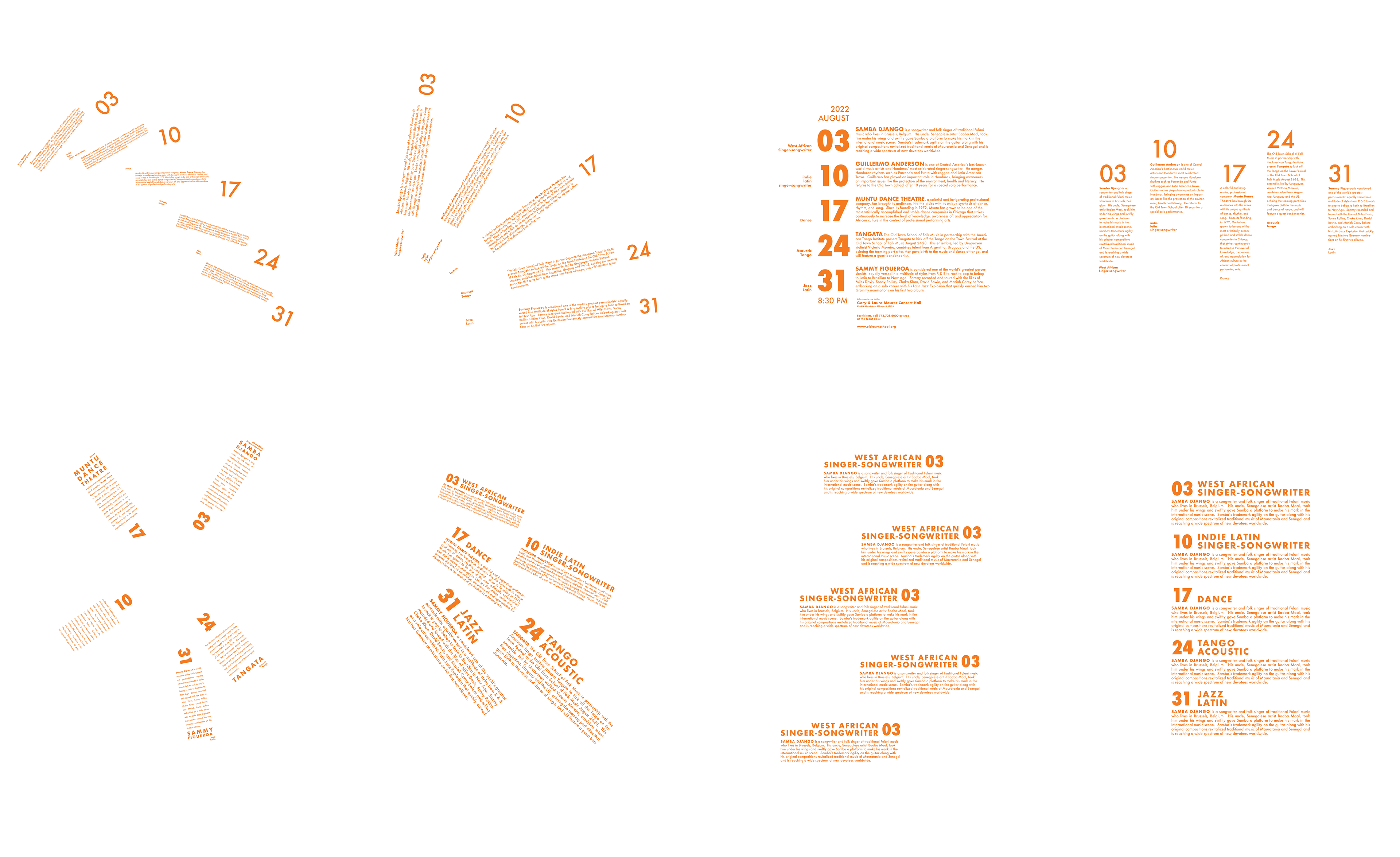
Editions.